Problem Statement
As a new mom, I was going through the process myself as I began this course. In today’s working world, most parents are working full time and can’t stay home with their children. They are looking for someone reliable and easily accessible.
User Research
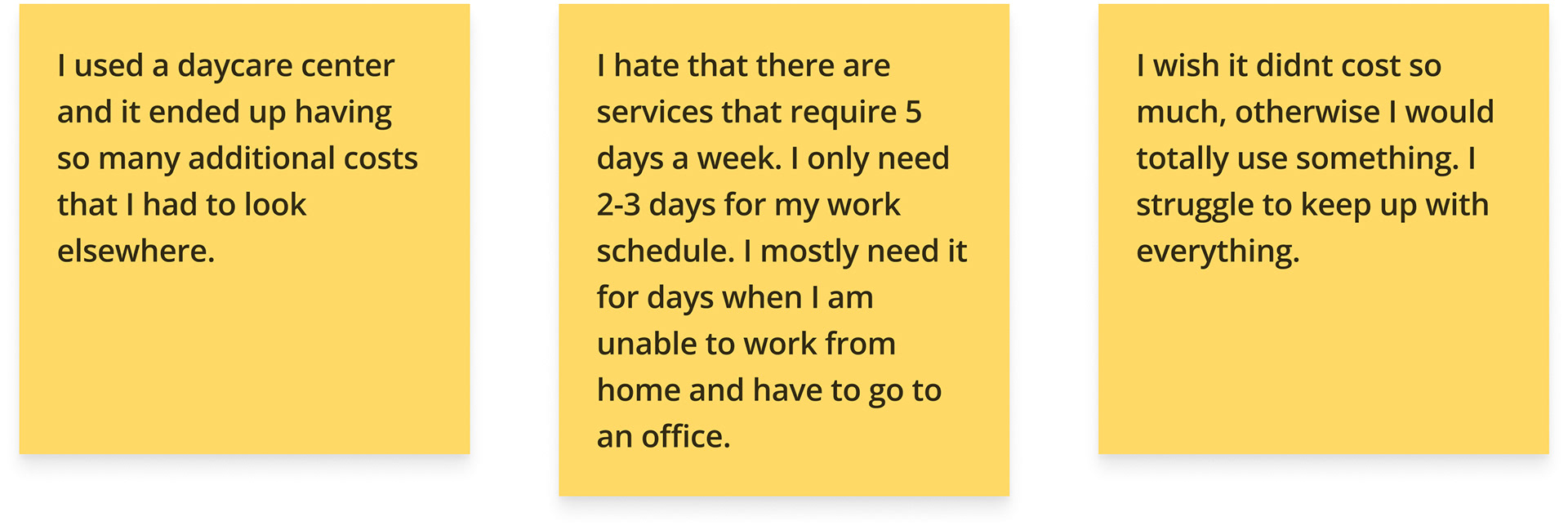
I interviewed 3 people in person, in addition to posting for feedback on social media. Most parents have a difficult time finding someone who is reliable and in their budget. Since daycare is very expensive, they have to be able to afford it in addition to all the monthly bills. Some daycares have a turnaround but are affordable, and others are so expensive but provide more services.
Background checks are a huge item for parents. While my state has lists online of licensed providers, not all states do. You have to be able to trust the person who is caring for your child.
Market Research
Unfortunately, there are not a lot of options out there for parents. Typically, they are found through word of mouth or doing research themselves online. Looking through google, the reviews tend to be subjective.
After doing research, I found two platforms for daycare search, Care.com and Weecare.
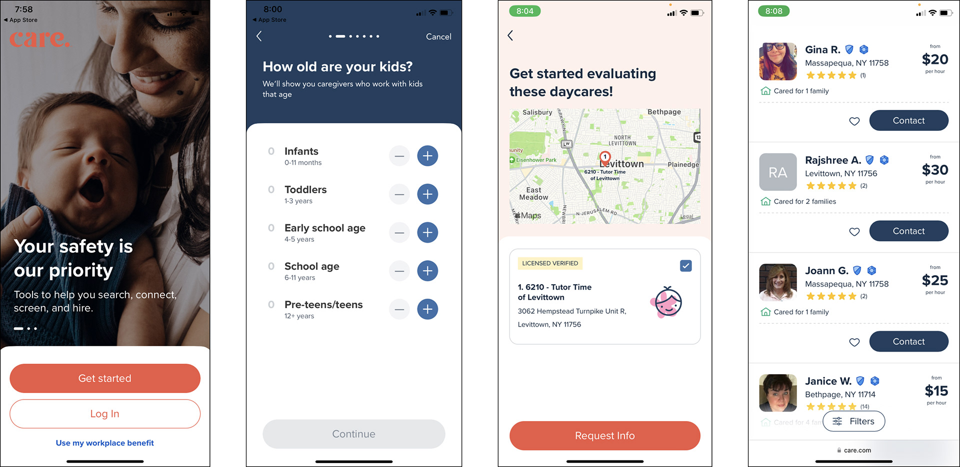
Competitor 1: Care.com
They provide other options from child care. They also offer senior care, tutoring, pet care and other home services.
On their website, they provide data about daycare but that wasn’t on the mobile app. I did like this feature so it should have been included.
The main issue I had was that the website and mobile app content was very different. There was a lot more information on desktop that would have been much nicer if included on the mobile app.
Competitor 2: WeeCare
They provide a lot of related information for childcare. Whether it is child care, day care or activities, lessons and a forum for parents.
The app was very clean but the map was a bit hard to navigate.

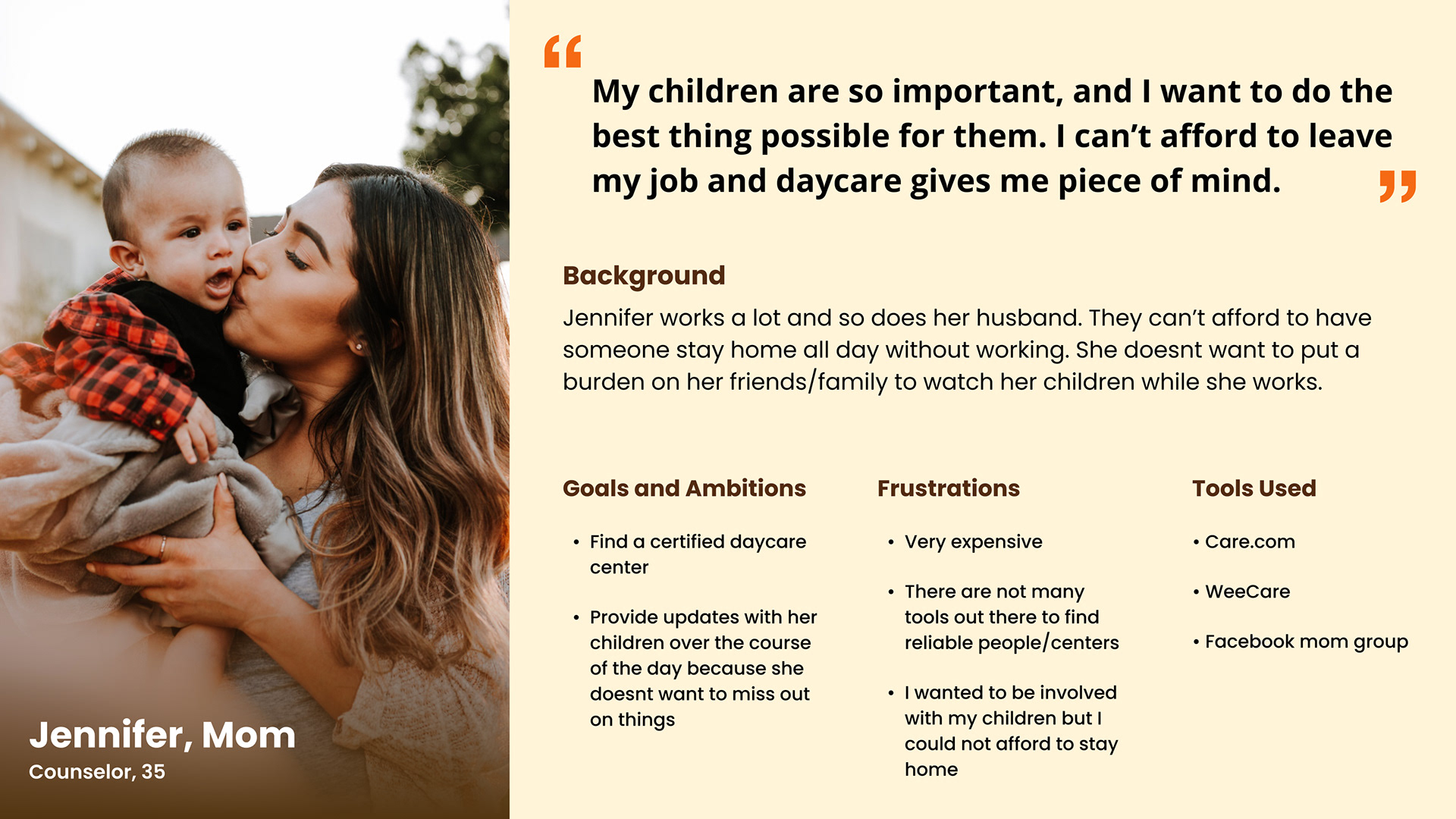
Persona
After conducting several user interviews, I was able to focus on the persona of users for this type of app.
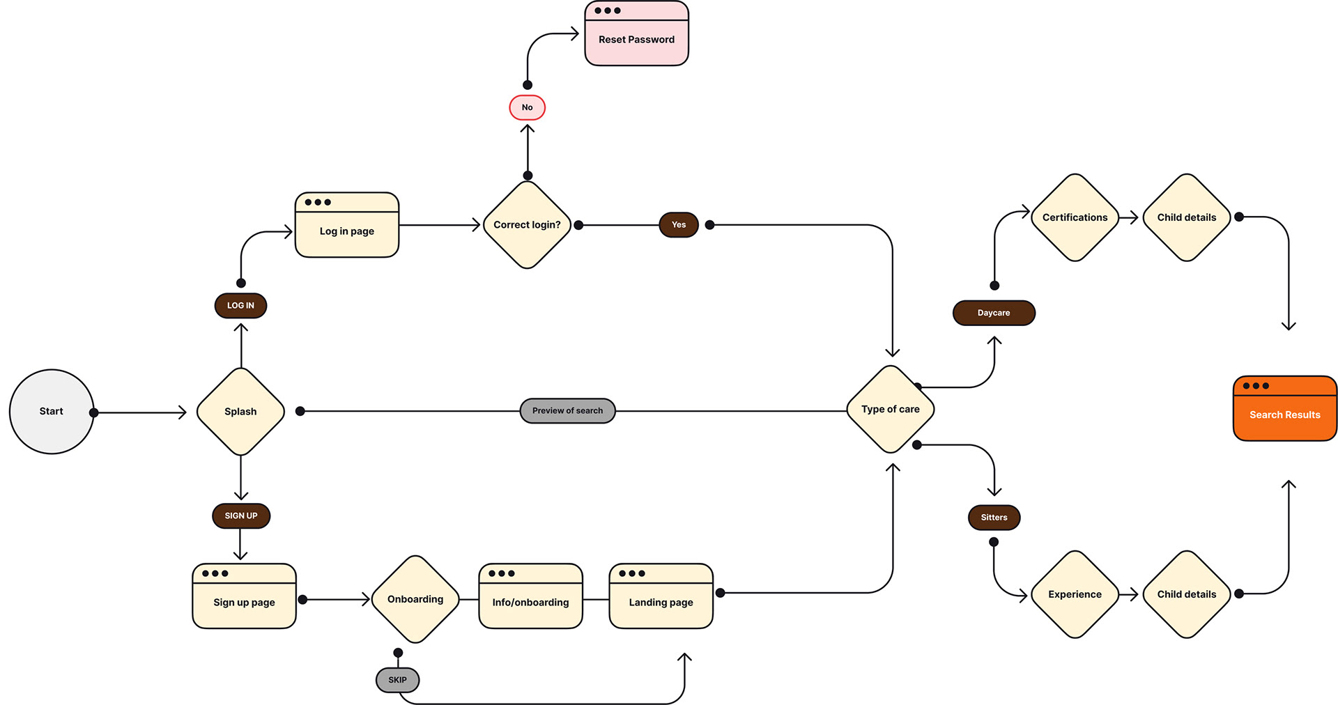
Initial User flow
My final user flow ended up being different than the one I created initially. The one I created had a lot more steps to find your results. I also had an option for a preview search, which after designing was not working well.
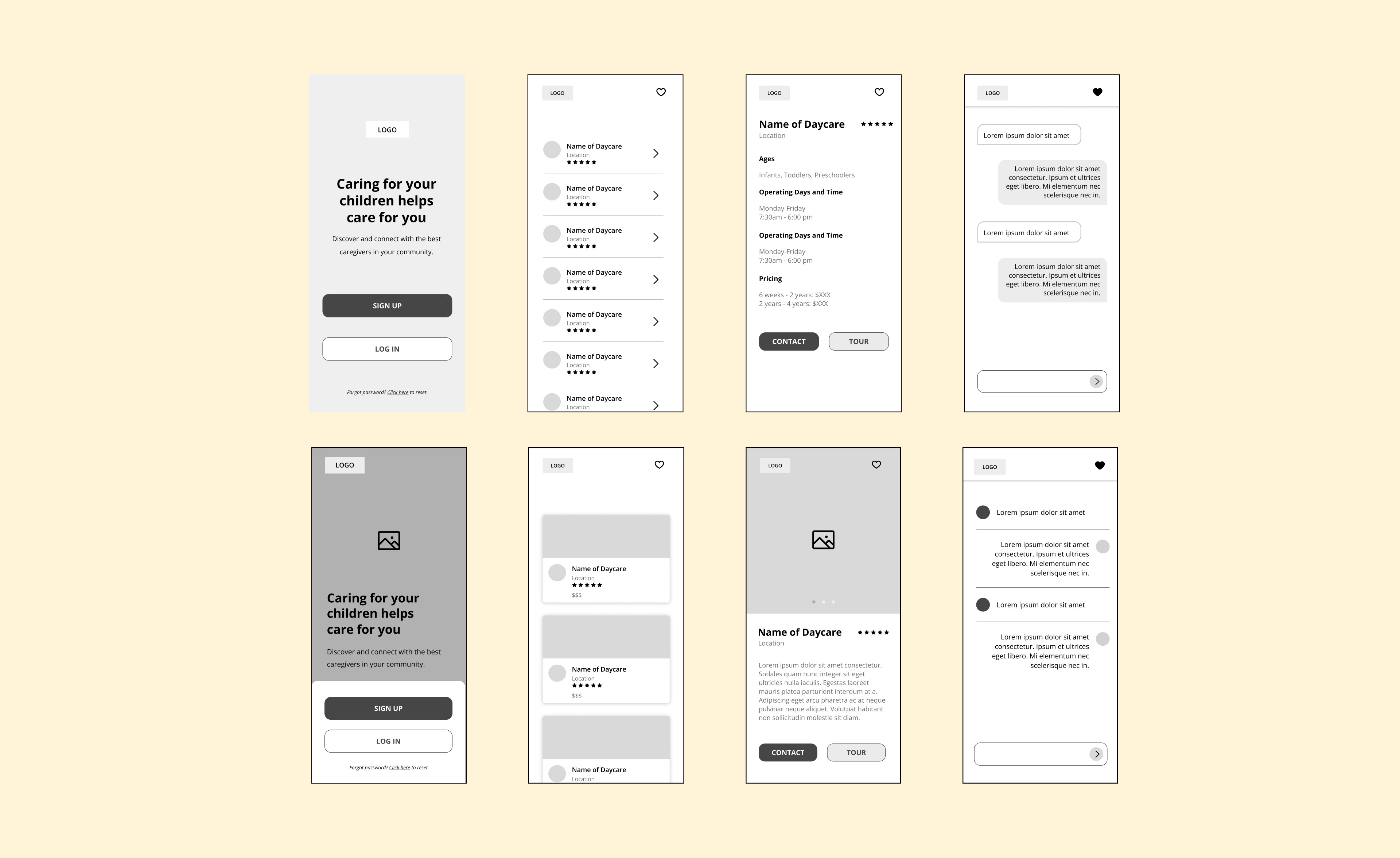
Wireframes
After doing my research and interviews, I began working with a variety of wireframes for my app. I started researching the typical onboarding style for a general app and how information could be listed.
Visual Design
Moodboard
My starting point for moodboard inspiration was coloring you typically see in schools. Everything is brightly colored and happy.

After doing my moodboard, I focused on a bright color design. Typically anything “children” related has bright coloring and illustrations.
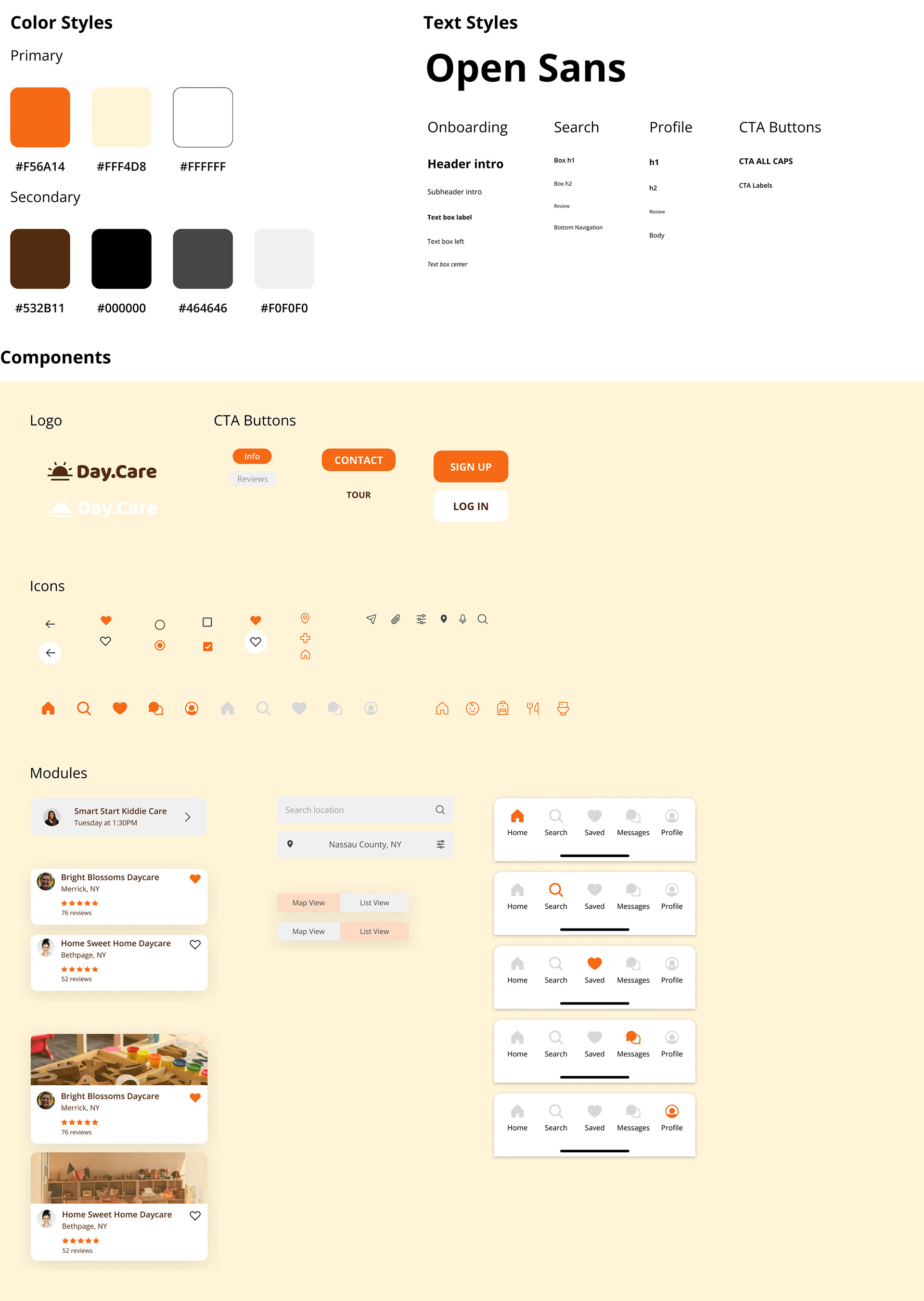
Design System
Prototype + test
After sending prototype to a variety of people, they were unsure about what was “active” and what was not. I returned to my prototype and added more directional items and screens.
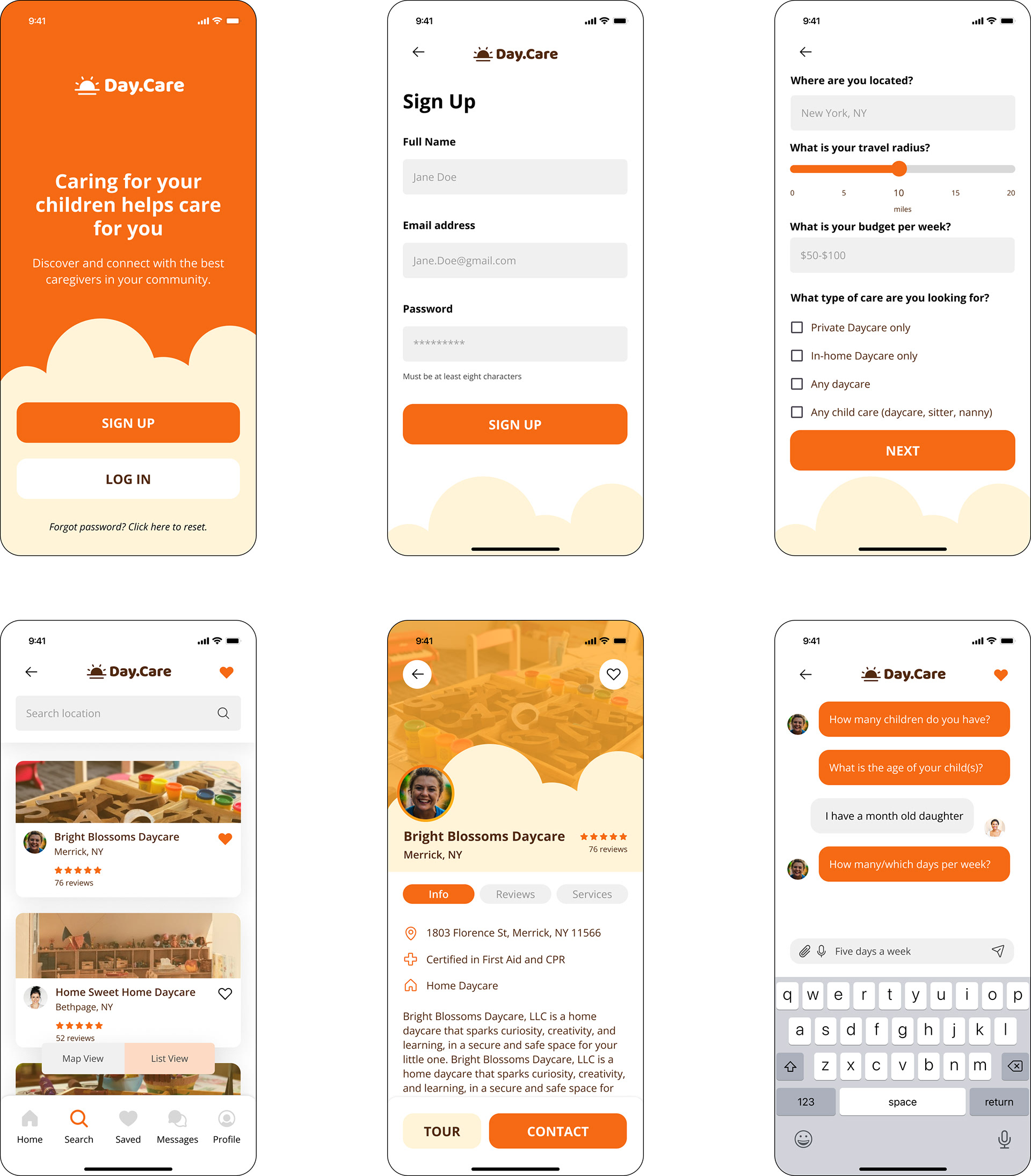
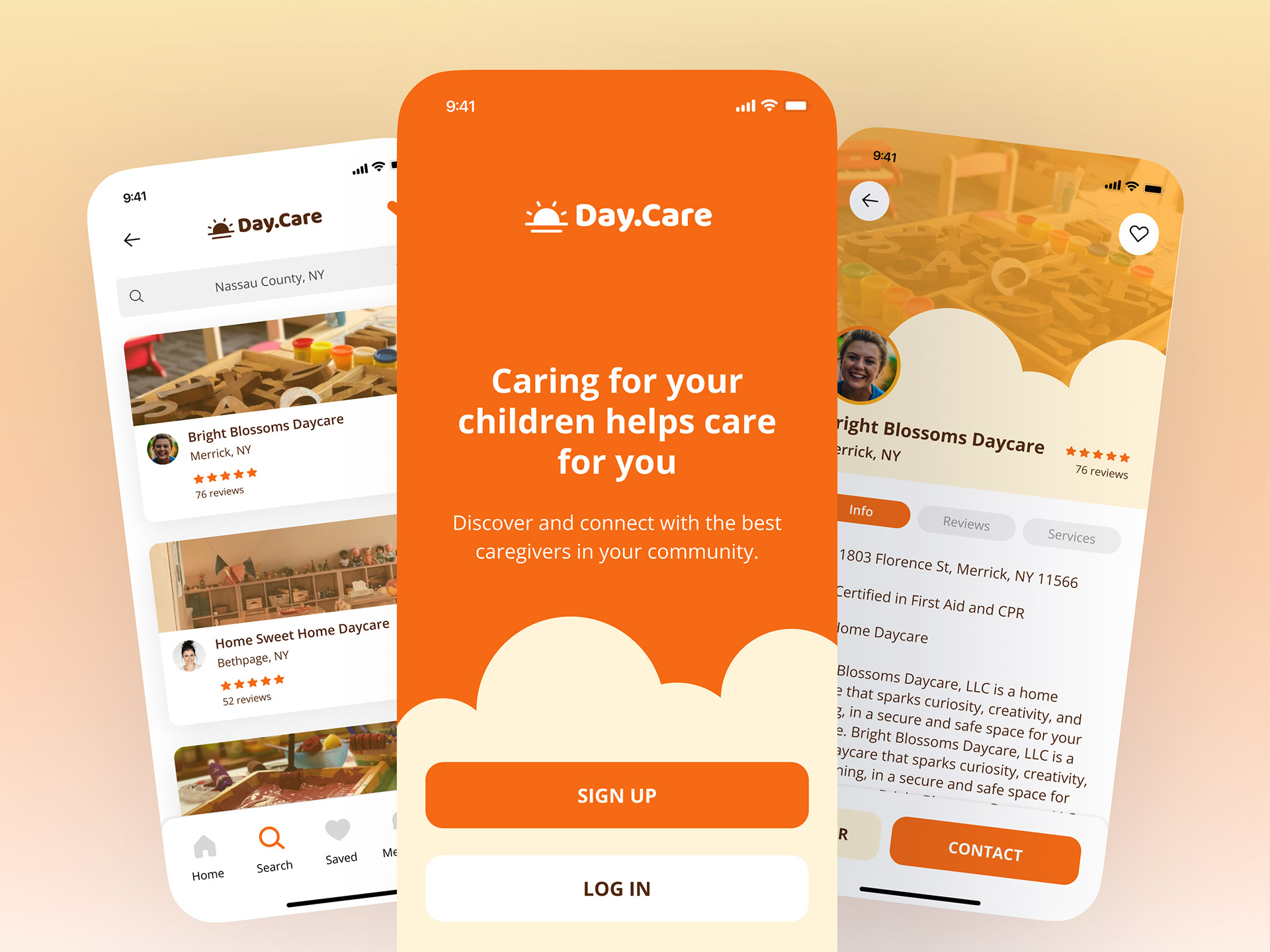
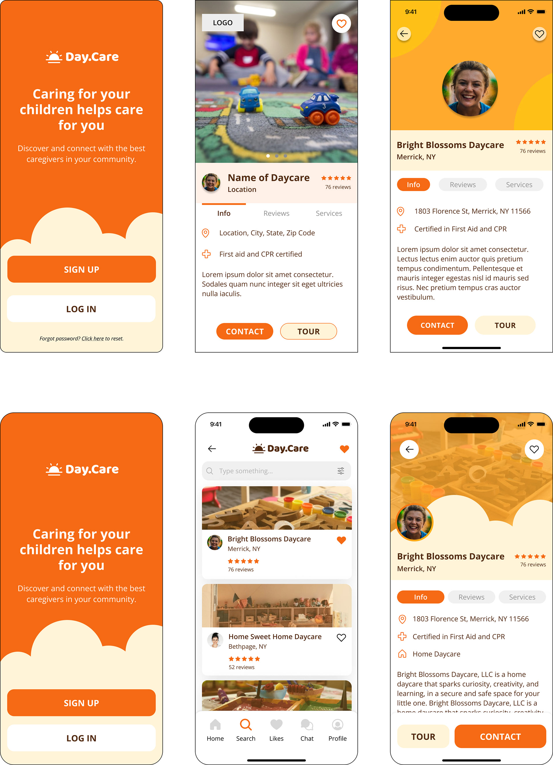
Final Screens
After editing, I ended up creating a variety of screens. Not all are included but some that were created were a splash page, onboarding, search page, profile and chat screen.The onboarding screens were only accessed when a user selected “Sign Up”. If login was selected, they went straight to the search screen.