
About the project
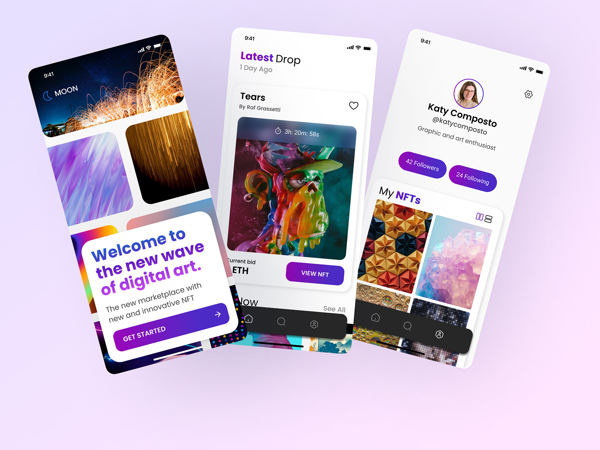
As part of Dribbble's four-week UI Design course, I created an NFT Marketplace app called Moon, based on the brief and wireframes provided in the course.
The Brief
Client
Moon, a new up and coming startup with the goal of revolutionizing the NFT marketplace with a design-focused approach and a deeply curated experience for the users.
Objective
The goal of this project was to establish visual language of this new NFT app that is ready to revolutionize the digital art scene. After locking a visual aesthetic, scale the design for multiple screens, based on the wireframes and the flow that was provided.
Audience
The audience is mainly, tech savvy people that know their way online and in the world of crypto and NFT, and a strong sense for visual aesthetic and art.
My Process
Step 1: Moodboard
For my moodboards, I started with two different styles. Searching Dribbble, Pinterest, and other design search platforms for my visual inspiration.
My first moodboard was a dark mode style, focusing heavily on gradients and abstract images.
For my second, I using more of a clean style, focusing on more negative space in the designs.
I liked the style of my first mood board but after exploration, I decided to do a combination of them. Using the colorful gradients of moodboard 1 and the white mode of moodboard 2.
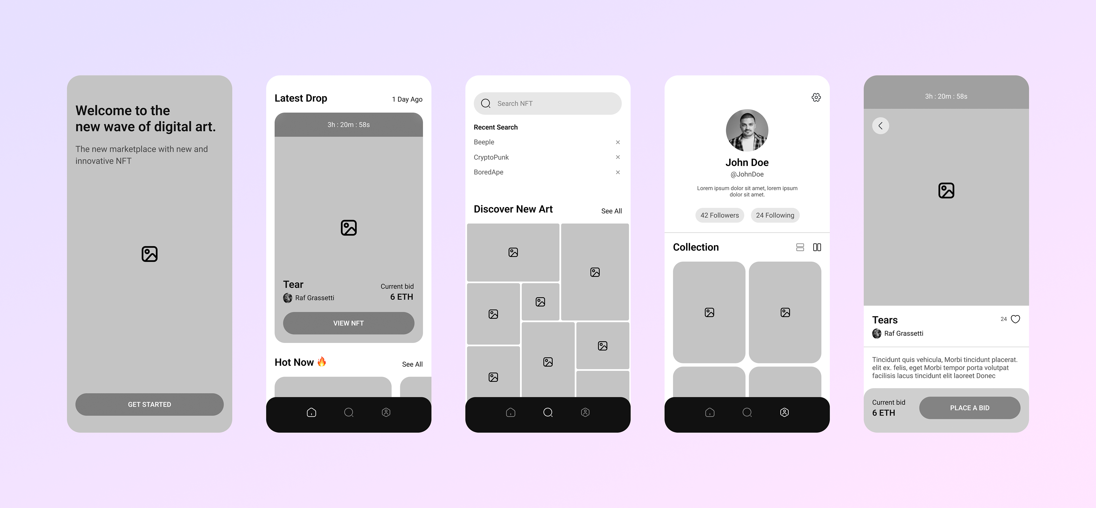
Step 2: Wireframes
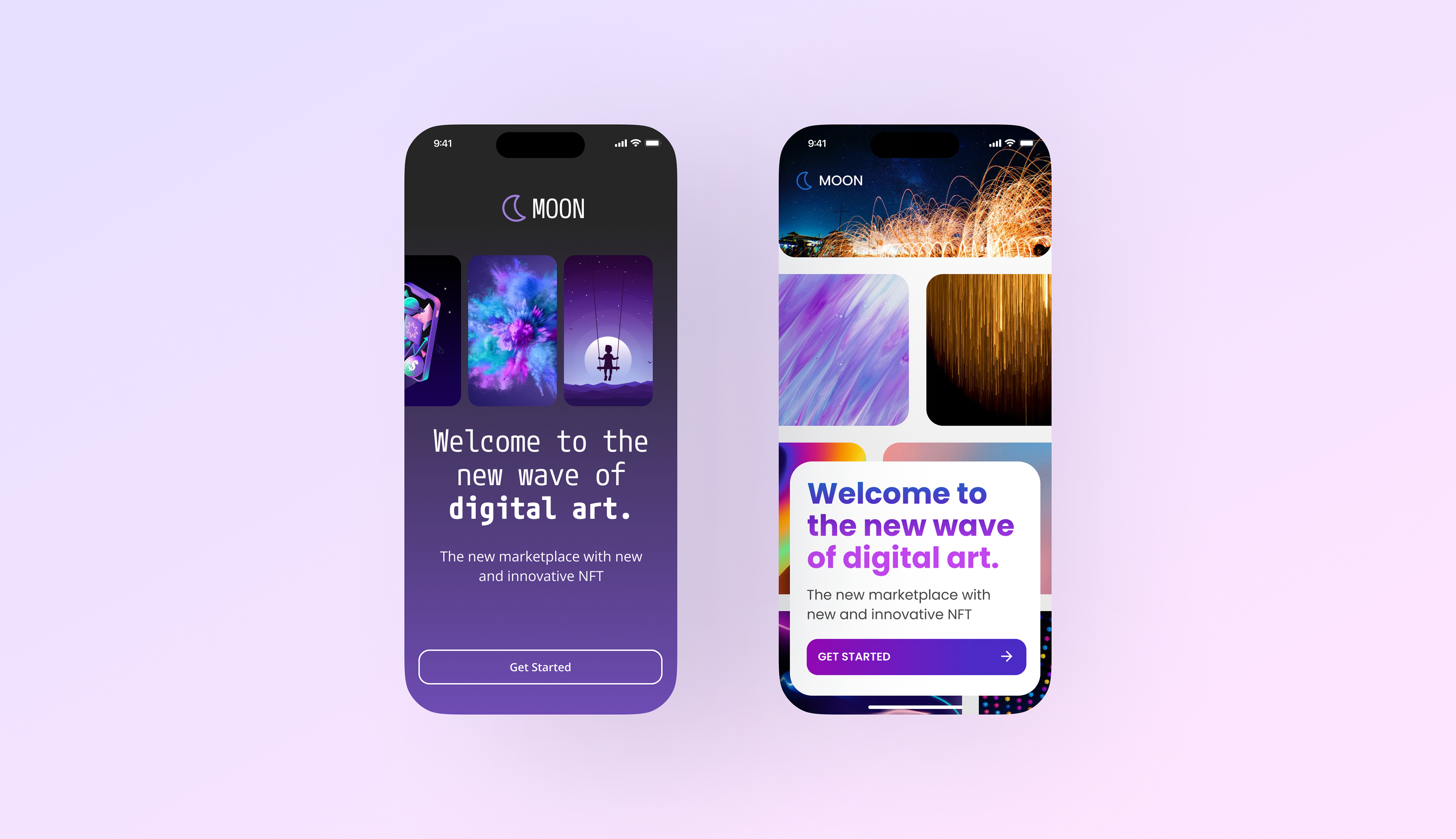
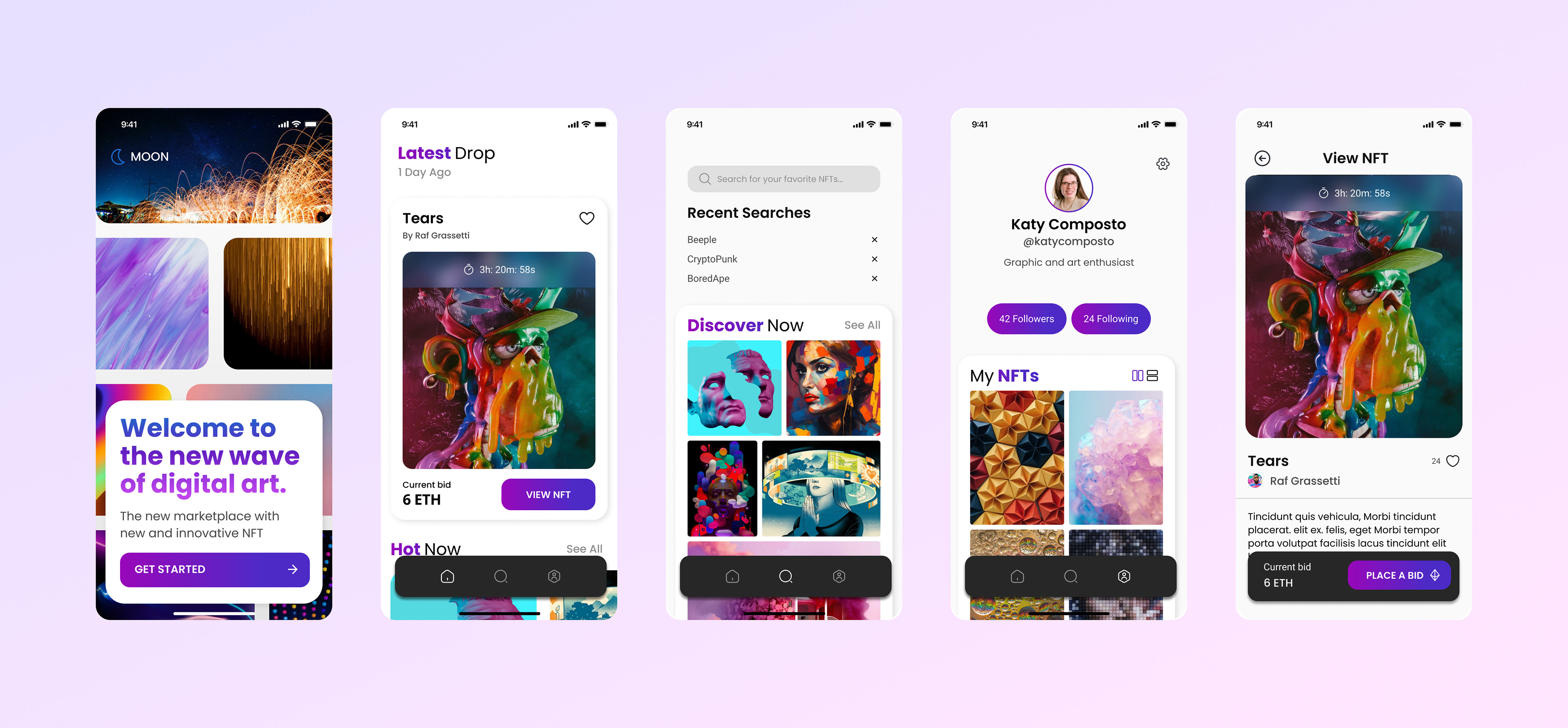
5 Wireframe screens were provided for the project. This included a splash screen, home screen, search screen, profile screen and nft page screen.
Step 3: Visuals
Based on my two moodboards, I selected different elements that I wanted to focus on in my design.
The aesthetic that I liked the most was the use of gradients and rounded corners. After narrowing down my concept and iterations, I decided on the look and feel that I liked.
After going with two different design styles, I ended up focusing more on option 2. This incorporated more imagery, giving me room for my creativity.
Option 1 focused on the color scheme more than the imagery.
The Result
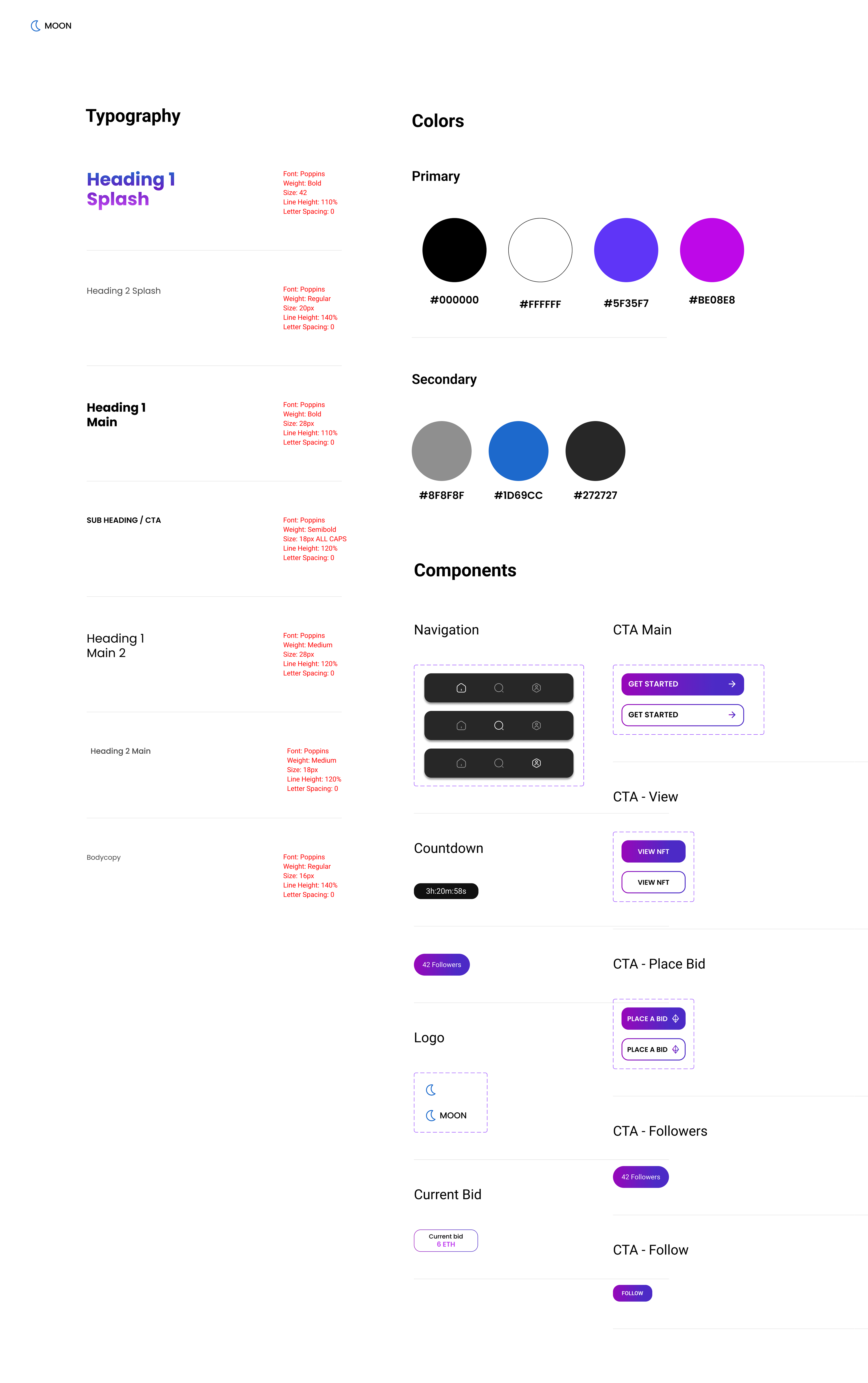
Design System
During the creative process it was essential to keep items consistent and easy to update.
Using a design system with type styles, color styles and components made it very easy to make updates across various screens. Without a system, I would need to go screen by screen and spend a lot more time.
What Did I Learn?
Research and inspiration are the key to a successful mobile app. Without doing mood boards, or even researching what design style the audience would prefer, this would not have been a success.
Learn the tool better. I need to sharpen my skills with the key tools in figma, such as auto layout. I am still learning and instead of starting "clean" from the beginning, I had a ton of frames and un-named layers.